Blog update log
2022-04-18 | Removed the right sidebar widgets, adjusted page width, added a Tags section to the Archive page, and removed the Home button from the left sidebar. Also changed the site info text to You need to have some concerns and, even better, a bit of anger.
2022-04-17 | Added a Channel.io chat bubble in the lower-right corner following a setup note I found useful. Switched the fanfic site theme to Stack. Also adjusted the text selection style and inline code style.
2022-03-02 | Added counters to the category widget, changed the widget icon, and removed the Mastodon social link.
2022-01-27 | Added recommended reading to the category widget and enabled email notifications for comments.
To-do
- I wanted a music player | embedded links from a music site ended up solving that problem for me
- Rework the category widget
- Add a Quote shortcode — looks a little difficult, but very pretty
After a few CSS and HTML lessons on FreeCodeCamp, I finally worked up the nerve to start operating on my blog.
Programming is wonderful in one very specific way: if you break something, you can swap files fast and put out the fire. Since I don’t really know how to read change history, and am not even sure whether I can read change history, and since I am both forgetful and not exactly a top student, I need a full written record of this impulsive construction project.
One thing I learned very firmly after fumbling around for a while: Ctrl+Z is undo, Ctrl+Y is redo. Those two magic buttons, plus Ctrl+S, made me feel like a cat scratching the sofa and then stepping back to inspect the damage before going in again.
With absolutely no programming background, every small change felt like an achievement. So to make writing this more fun—and to leave something my forgetful future self can review—I’m recording the whole clumsy chain of thought in detail.
Turning rounded cards into sharp corners
The very first FreeCodeCamp lesson paid off immediately. Rounded versus square corners falls under border-radius. In \assets\scss\variables.scss:
--tag-border-radius: 0px; // 标签圆角改直角,由4改为0px
The comments section was added later, so if I wanted that to stay rounded, I had to go into \layouts\partials\comments\provider\waline.html and change it separately.
The code block problem
That previous edit created a new problem. I wanted tags to have square corners, but inline code blocks live inside the article body, and they were borrowing the same style. So they needed their own adjustment.
code {
color: var(--code-text-color);
background-color: var(--code-background-color);
padding: 2px 4px;
border-radius: 5px; // 单独改为4px
font-family: var(--code-font-family);
}
The left sidebar
Menu
The menu styles live in \assets\scss\partials\menu.scss.
    li {

    ......

        @include respond(md) {
            width: 77%; //我希望它们和标题与描述一起居中,但修改半天实在做不到,先这样。
            text-align:left; // left好看
            padding: 0px 0; // 10px 0 改为1px 0 是菜单栏的间距
        }
I wanted the menu items centered together with the title and description, but after a lot of messing around I still couldn’t pull it off, so this was the compromise.
Dark mode toggle
The dark mode toggle sat at the bottom by default. I wanted it higher up. This part is in \assets\scss\partials\sidebar.scss.
#dark-mode-toggle {
    margin-top: 10px; // auto改为10px,暗色模式按钮与菜单最后一栏的间距
Adjusting the left sidebar proportions
As far as I remember, I first brute-forced the avatar margin, then reworked the title and description alignment based on another Stack-theme customization write-up that originally got me interested in changing my blog at all. I copied plenty during this process, and I was very grateful for that help.
Reworking the right-side widgets
I don’t like organizing posts by year, especially when almost everything on my blog was written after 2020 anyway. The 2019–2022 stretch blurred together at a speed I still find unnerving. So I disabled archives in config.yaml.
Adding a category widget instead
Once the archive widget was gone, the right side looked empty. I wanted categories there instead. Stack doesn’t come with a built-in category widget, and after digging through file after file, it looked annoyingly troublesome to implement. Then I found a section in a Hugo Eureka setup guide that gave me a way in, and from there I started searching for how other people using similar themes had handled it.
The key idea was this: in Hugo, categories and tags are both basically folders. When you click them on the site, you are just entering those folders. So the category widget I wanted was, in spirit, just another form of tag list—except arranged more like an archive list.
That was enough to tell me where to look.
All the right-side features—table of contents, search, tag cloud, archive—are widgets. And widgets matter in three different places:
- They are enabled in
config.yaml. - Their template files live in
\layouts\partials\widget. - Their shared styling is managed in
\assets\scss\partials\widgets.scss.
In config.yaml, the enabled widgets looked like this:
    widgets:
      enabled:
        - toc
        - search
        - archives
        - tag-cloud
So if I wanted a new widget that linked into categories, I needed to make a new file in that widget folder—categories.html—and then hook it into the existing widget styling system through widgets.scss.
A lot of the other edits I made worked the same way: one place calls a feature, another defines the markup, another controls the styles. I could feel myself only half understanding it, but still understanding more than before.
Actually building it
Writing this down afterward makes the process look much cleaner than it was. At the time it was a mess. Two days later, I’d already forgotten half of what I did. So what follows is a mixture of: things I thought I understood, things I didn’t understand then but think I understand now, and things I still don’t fully understand but somehow got working anyway.
At one point, while I was still stumbling around, I found a blog with exactly the kind of category widget I wanted. Clicking through it repeatedly finally made the obvious click into place: these things are all just hyperlinks.
The left border styling on my version was inspired by another person’s widget setup. I strongly suspect their approach was smarter than mine.
Here was the rough process:
- Back everything up.
- Rather than creating a widget from scratch with a command, I simply copied
\layouts\partials\widget\archives.htmland renamed itcategories.html.
I compared the archive widget file with widgets.scss, using my very thin CSS knowledge to guess what each part was doing. The layout appeared in a top-down order on the page—icon, widget title, widget body—and those pieces all used classes already defined in widgets.scss.
What I needed was much simpler than archives: just a card full of links, something spiritually close to the tag cloud. I noticed the tag cloud used a line like this:
<a href="{{ .Page.RelPermalink }}" class="font_size_{{ .Count }}">
At that point I barely cared about the deeper mechanics. As long as href meant link, I could keep moving.
The archive widget itself was more complex because it automatically grouped content by year. Looking at the other widgets made it obvious that I could keep the shared outer structure, keep the icon and title section from archives, and delete almost everything else.
This section from the archive widget gave me the icon and title structure:
    <section class="widget archives">
        <div class="widget-icon">
            {{ partial "helper/icon" "infinity" }}
        </div>
        <h2 class="widget-title section-title">{{ T "widget.archives.title" }}</h2>
I changed the last line to:
<h2 class="widget-title section-title">Categories</h2>
Then I moved over to widgets.scss and added styling for the new widget. I copied the archive widget styles, renamed the related selectors to Categories, shortened the width, and reused the link and font setup from .archives-year, except without a count. The weight looked too heavy, so I changed font-weight to 1. Beyond that, I copied almost everything I could get away with.
I also wanted a colored left border for each category card. I had learned a bit about border, but wasn’t sure whether I could use it the way I wanted. It looked a lot like the way the theme styled headings such as <h1> and <h2>, where article.scss used border-left: var(--heading-border-size) solid var(--accent-color);.
But border-left refused to work for me. So I changed tactics and used border-width instead, setting the top, right, and bottom to 0 and only keeping the left side.
.widget.categories {
    .widget-categories--list {
        border-radius: var(--card-border-radius);
        box-shadow: var(--shadow-l1);
        background-color: var(--card-background);
        width: 80%;
    }

    .card-category {
        border-style: solid;
        border-width: 0 0 0 12px;

        a {
            font-size: 1.4rem;
            padding: 18px 25px;
            display: flex;

            span.categories {
                flex: 1;
                color: var(--card-text-color-main);
                font-weight: 1;
            }

        }
    }
}
That was the new code added in widgets.scss. Then I returned to categories.html and hooked it up.
I still couldn’t fully figure out how to make the widget populate itself automatically whenever I assigned a category while writing a post. But since I only had a few categories anyway—two or three—I stopped fighting that battle and just hardcoded the hyperlinks.
Because I wanted the categories displayed in an archive-style list, I used widget-archive--list from archives.html as a model, swapped the class names, and inserted links. Here is the full file:
    {{- $query := first 1 (where .Site.Pages "Layout" "==" "archives") -}}
    {{- if $query -}}
        {{- $archivesPage := index $query 0 -}}
        <section class="widget categories">
            <div class="widget-icon">
                {{ partial "helper/icon" "infinity" }}
            </div>
            <h2 class="widget-title section-title">Categories</h2>
        <div class="widget-categories--list">
                <div class="card-category" style="border-color: #93B5C6;">
                    <a href="/categories/扭断那天鹅的脖子/">
                        <span class="categories">扭断那天鹅的脖子</span></a>
                </div>
                <div class="card-category" style="border-color: #93b5c6b2;">
                    <a href="/categories/为沙滩插上太阳伞/">
                        <span class="categories">为沙滩插上太阳伞</span></a>
                </div>
                <div class="card-category" style="border-color: #93b5c64b;">
                    <a href="/categories/碎片/">
                        <span class="categories">碎片</span></a>
                </div>
        </div>
        </section>
    {{- else -}}
        {{- warnf "Archives page not found. Create a page with layout: archives." -}}
    {{- end -}}
I spent a ridiculous amount of time on small things here. How did other people make every left border a different color? Why did my tags keep breaking because I forgot to close one thing or another? Where exactly did the text need to sit so the category names displayed properly?
For the border colors, I ended up not managing them through a shared class at all. I styled them inline with style.
This was absolutely not the best possible solution. The best solution is obviously to keep learning.
Adding a left border to the table of contents widget
Once I had learned how to force a left border onto things, I immediately decided the table of contents should get one too.
Since TOC is a built-in widget, this was easy. In \assets\scss\partials\layout\article.scss:
.widget--toc {
    background-color: var(--card-background);
    border-radius: 1px (--card-border-radius);
    box-shadow: var(--shadow-l1);
    display: flex;
    flex-direction: column;
    color: var(--card-text-color-main);
    overflow: hidden;
    width: 80%;
    border-style: solid;
    border-width: 0 0 0 12px;
    border-color: #93B5C6; // 增加了四行,更改宽度与左边框
Changing the width of the left navigation area
In \assets\scss\partials\sidebar.scss:
.left-sidebar {
    display: flex;
    flex-direction: column;
    flex-shrink: 0;
    align-self: stretch;

    width: 100%;
    padding: 30px 0 15px 0;
    max-width: none;
    min-width: 15%; // 左侧导航栏的宽度
Adding email notifications to Waline comments
It took me a long time to touch email notifications at all. I had already read the Waline documentation earlier, failed to understand it, and developed a bit of fear of the whole thing. Recently I got bolder and started fiddling with it again. It finally worked, so here’s the process.
My comment system was deployed on Vercel, which made the setup fairly simple, and the sending mailbox—the SMTP provider mentioned in the documentation—was Gmail.
To enable email notifications, I went to the deployed comment project in Vercel and opened Dashboard → Setting → Environment Variables. Then I added the variable names required by the documentation under NAME, filled in the corresponding values under VALUE, and clicked ADD.
I only added the required ones. After that, it looked like this:
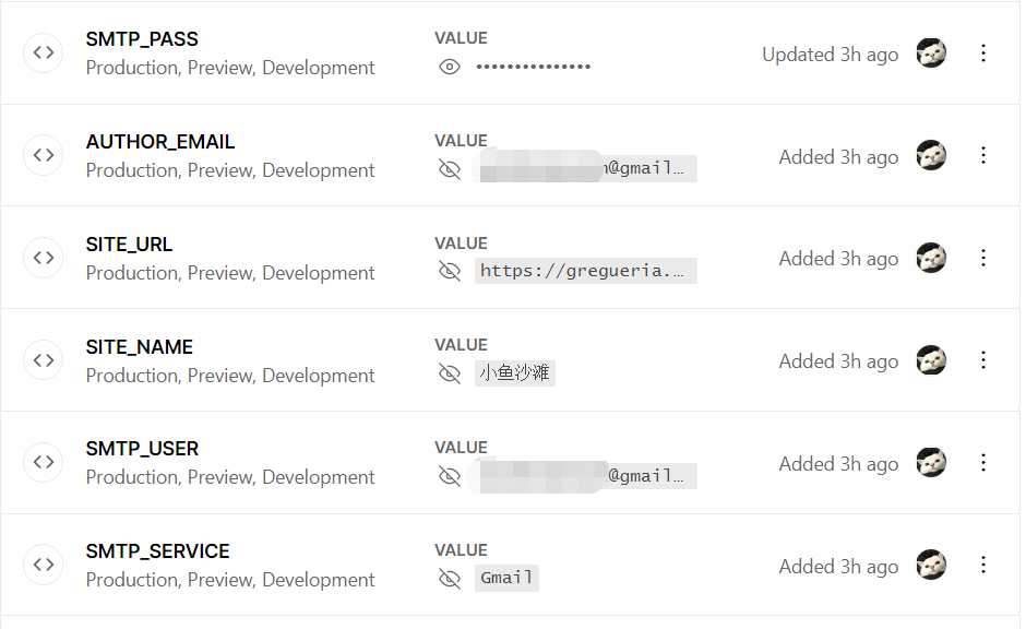
If you’re also using Gmail, there is one important catch: for SMTP_PASS, you cannot use your regular mailbox password. You need an app password instead.
After that, IMAP access also needs to be enabled in Gmail settings. Once that was done, I had to go back to Vercel and redeploy the comment project:
Project → Deployments → click the three dots on the top deployment → Redeploy
Honestly, redeploying took so long and produced so many warnings that I got very nervous waiting for it. But once the deployment succeeded and I saw the email notifications start arriving, everything felt instantly worth it.
I still haven’t figured out how to customize the email template, so I’m using Waline’s default template. It looks like this:


Removing device and browser version display
After enabling email notifications and redeploying Waline, I noticed that commenter nicknames suddenly showed device and browser version info underneath. I guessed this was a newer Waline feature, but to me it was completely unnecessary. I really do not need that much information about strangers on the internet.
I couldn’t find the answer in the docs or issue tracker, so I asked directly and learned that the environment variable DISABLE_USERAGENT would do it. Setting that variable to true and redeploying removed the extra info.
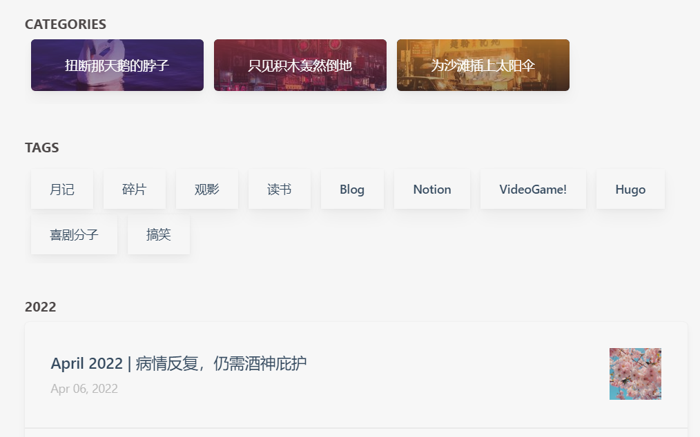
Adding a tag section to the Archive page
Later, after removing the sidebar widgets entirely, I still wanted a tag cloud somewhere. So I moved that function to the Archive page.
In layouts\_default\archives.html, after the {{ end }} on line 14—below the Categories section on the Archive page—I added:
    {{- $taxonomy := $.Site.GetPage "taxonomyTerm" "tags" -}}
    {{- $terms := $taxonomy.Pages -}}
    {{ if $terms }}
    <h2 class="section-title">{{ $taxonomy.Title }}</h2>
    <div class="subsection-list">
        <div class="article-list--tagtile">
            {{ range $terms }}
                {{ partial "article-list/tile" (dict "context" . "size" "250x150" "Type" "taxonomy") }}
            {{ end }}
        </div>
    </div>
    {{ end }}
Then in assets\scss\partials\layout\list.scss, I searched for .subsection-list and added the following inside its braces:
    .article-list--tagtile {
        display: flex;
        padding-bottom: 10px;
        flex-wrap: wrap; //实现Archive中的Tag卡片自动换行

        article {
            width: auto; //改爲200px
            height: auto; //改爲50px
            margin-left: 7px;
            margin-right: 5px; //改爲5px
            margin-top: 7px; //新增一行
            flex-shrink: 0;
            box-shadow: var(--shadow-l2); //改个卡片阴影

            .article-title {
                margin: 0;
                font-size: 1.4rem;
            }

            .article-details {
                padding: 15px 22px;
            }

        }
    }
That produced this result:
Changing the width of the main content area
Once the right sidebar widgets were gone—this part can be disabled directly in config.yaml—the main content area became too wide. It took a long time, but I finally got the width where I wanted it.
In assets\scss\grid.scss:
    &.compact {
        @include respond(md) {
            --left-sidebar-max-width: 25%;
            max-width: 768px;
        }

        @include respond(lg) {
            max-width: 1024px;
            --left-sidebar-max-width: 20%;
        }

        @include respond(xl) {
            max-width: 1050px; //主版面宽度改为1050px
        }
    }
}
Then the left sidebar suddenly felt cramped, so I had to go back into assets\scss\partials\menu.scss and tweak this part too:
        @include respond(md) {
            width: 80%; //修改为80%
            text-align:left;
            padding: 0px;
        }
The one real drawback after removing the widgets is that I no longer have a table of contents there. A little sad, honestly. XD